Almighty Antares Interface Upgrade

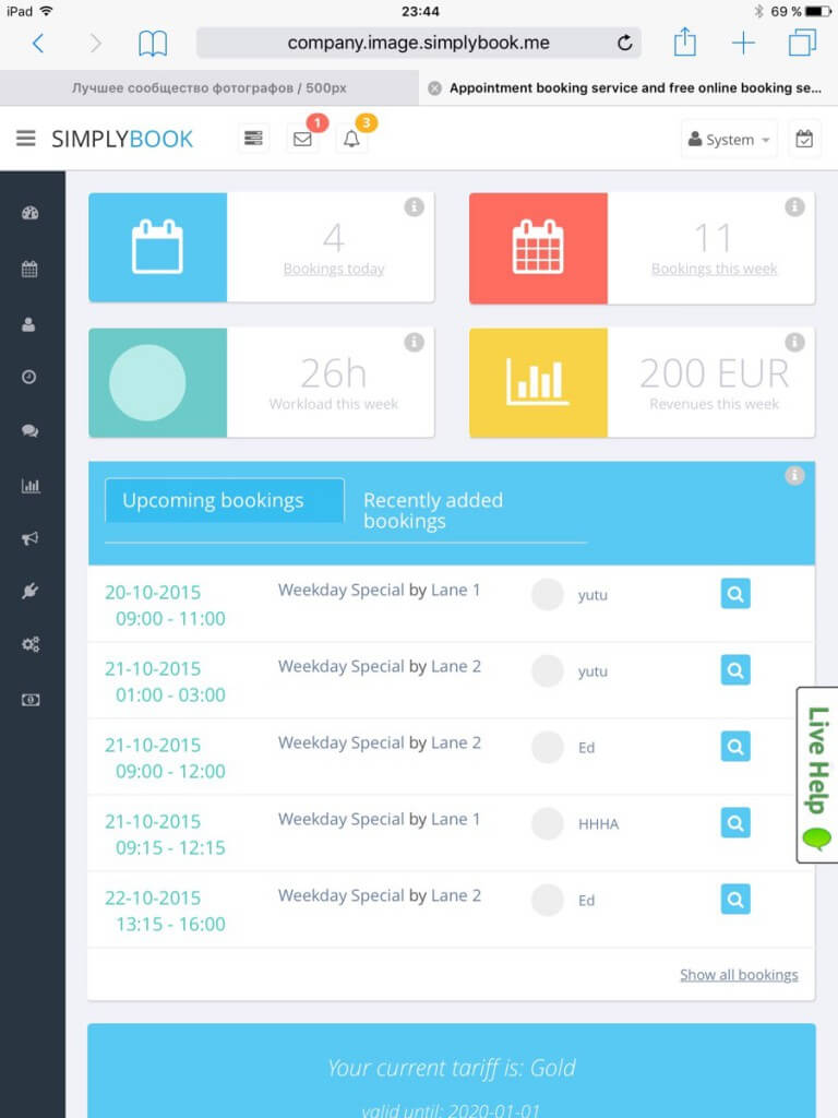
We are pleased to announce that we are launched an improved version of our user administration side of the SimplyBook.me system today! Our goal with the Almighty Antares upgrade is to simplify the user interface further and help you to better organize your business in the best way possible.
The launch day that we have eagerly awaited is over and the whole team was on full alert fixing small issues that always come up in a big upgrade like this. Some of our old users were requesting us to get the old version back while others contacted us to compliment on the changes. We are fully confident that with the new version our users will be much better off. After a few days of usage they will never look back.
Of course we could have done better so I will list some of the things we could have informed our users about before the upgrade here:
- Not all browsers are created equal! With complex systems like ours, one can not count on that all versions of IE (internet explorer) will work. However, most versions of Firefox, Chrome and the new Edge from Microsoft will work fine.
- Not everyone knows that CTRL-R is a magical thing. Many times when something looks strange and doesn’t work, all the user needs to do is to simply press CTRL – R while in the function. This will refresh the JavaScripts in the browser. This will in many cases change the interface for the better and make things that did not work, work again.
- The menu system has changed but all the functionality that was in the old interface is still here although they may not be in the same place as before. Just browse through it and get acquainted with the changes.
- In some places we had not placed enough information for users to understand how to use the functionality. We did try to add this already today as we were getting feedback from hundreds of users.
This is a first version of our upgrade, you will for sure see many things appear in the coming weeks. Let us know if you are missing something or what you think we should make differently. We are always open for user’s comments and suggestions.
Thank you for your patience and we assure you that we will continue to do our best to make this the best appointment booking system in the world.
Please send us your remarks here in the comments below.


評論
17 commentsVinicius
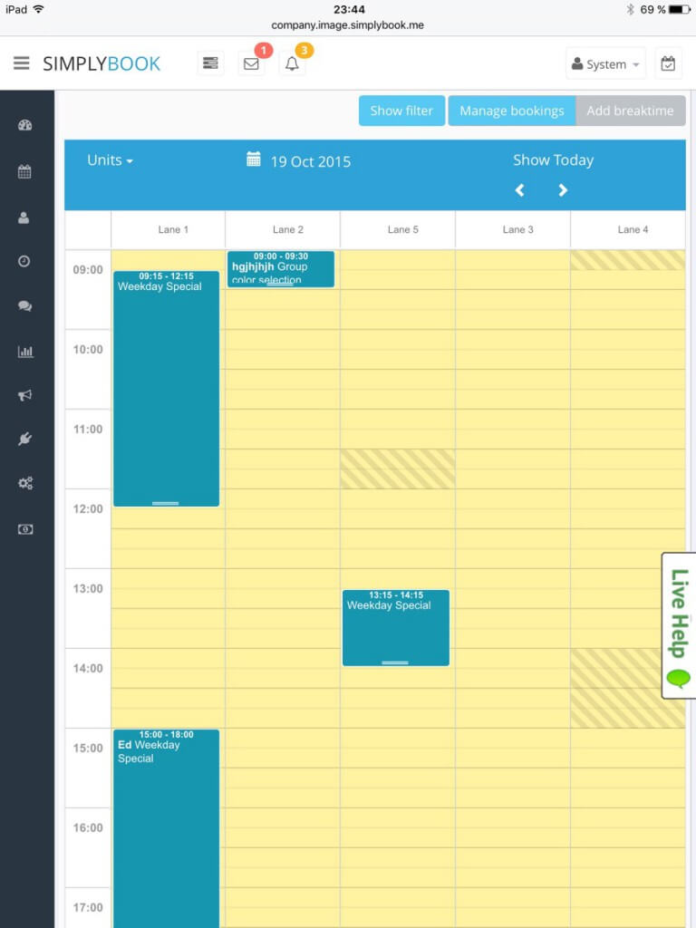
Having big trouble with new update, Since i have over 20 services provider can’t see them. Page frame try to fit all in the same window frame, and can’t move or resize, in my calendar all i can see are blue lines. Previous version was able to zoom and move btwn services providers. Looks great the new version but not not “simply”
admin
In which view are you having this trouble? Providers, daily or weekly view?
Vinicius
In all views. In Providers: Only see the lines In Day: its fine if only have less than 6 reservations. Weekly: Only see blue lines, Ex: Monday 1 reservation: It;s Fine i can see. But on Friday i have 15 reservations, and the calendar frame try to fit all 15 on same square. From an Ipad and Samsung note 3 mobile device can’t see all the providers. Since i have 15 providers, the screen frame try to fit all in an small screen like an mobile device. Already sent a screenshot to simplybook.me,
admin
Ok good, did you get answer from our help desk already?
Jimmy Hankins
we can not edit people already scheduled and also when you add new people if they do not have a email they can not sign in some people do not like to leave email
admin
There is more statistics for users on clients for cancelling etc so it is not possible to change client on booking. That booking needs to be cancelled and new booking created. In Settings // Email and SMS settings you can set either email or SMS as required but it must be one of those things to make client unique as many clients have same name. If it doesn’t matter, then just use some noreply email address like noreply@simplybook.me for those clients.
Jimmy Hankins
Also can not find clients history.
admin
Client history was being fully shown in booking by pressing booking. There were many complaints so now last comment is shown but we are adding link there so those who want can press it to see all comments.
admin
Already added to see all comments history directly from booking !
Shaun
Hi, Will be adding a print function, so as the dashboard can be printed?
admin
Already done !
Mohamed Mahgoub
In the service providers view, the clients names are all cramped together. The clients names are only half shown, while the service name completely disappears. I know that this is the case because we use 30 min booking, but shouldn’t there be a method to make the appointments appear fully, even if it means extending the tables?
admin
Should be better already ! Sorry about the inconvenience.
glow massage
My admin app is not loading. I can log in. It’s showing it’s trying to load but after 10minutes, It still has not loaded and I am definitely connected to the Internet.
admin
Do you use Android or iOs? a new much better iOS version is on the way to be approved by apple, should be available in a few days !
Wendee
Is there any option to change the awful yellow color and uneven diagonal lines on the calendar I have to stare at all day? I need options! (OCD is a curse, I promise).
admin
This is a very good point and some of our staff have complained about the choice of these colors as well ! We will certainly try to find some nicer colors for this very soon !